Sunday, 30 November 2014

Week 9: Character Project Update

A lot of Failure!

Hey everyone, another week has passed and it's time for an update on my current progress. After my failed first attempt at the new dichotomy character project last week, I went back to the drawing board and did my set of abstract silhouettes just using basic shapes. Here is the result of that:

I did a full set of 100 silhouettes, continuously adding on more detail and while the last few silhouettes were starting to give me some great shapes I just failed to see anything of value in them. Not having a clue at all in which direction I was going to take this project, I went to ask for help from the tutors and pretty much started over again.

The Beginnings of a New Idea

This time I started by coming up with a list of opposite words that I could use as a theme for my characters. This included some opposites such as "Hot and Cold" and "Alive and Dead". I then ended up picking out "Heaven and Hell" as my chosen opposites and created a moodboard based on those 2 terms:
Heaven and Hell Moodboard
After that I then thought about a style that I wanted to use for my characters and decided to go for a more stylised look and stick to a similar style to the one they used in The Legend of Zelda: Wind Waker. Again I created a moodboard to help me stick to my chosen style:
Wind Waker Moodboard

Development

After my 2 moodboards were created I went into idea generation once again and started off by creating a basic silhouette of an angel-like character using the simplified Wind Waker style. I did the same to create a basic shape for a demon-like character. I then used silhouettes of simplified objects that I could attach to both characters (such as wings, clothing, claws, etc.):
First Set of Silhouettes

After my first batch of silhouettes was done I then went into creating a second batch and mixing different elements of the silhouettes up a bit to see which would work best:
Second Set of Silhouettes
I then picked out a few silhouettes that worked well and paired them up together to see which would make the best pair:
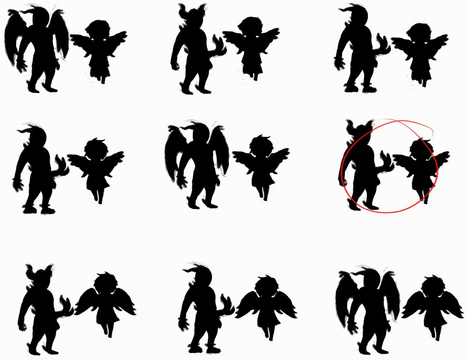
Pairing up Silhouettes
Eventually I decided that number 6 was the best, since the silhouettes are quite different, which is strengthening the dichotomy aspect of the duo. I decided that I didn't want both characters to have wings and that the upwards facing horns seemed to work best to make the demon character look a bit more intimidating. After I had chosen my pair I then went into painting on some detail onto the silhouettes. Again I tried to stick close to the Wind Waker art style, which turned out to be quite a challenge:
Detailed Final Silhouette
After I had finished painting on detail I then inverted the picture to give me white silhouettes with a black outline and then refined it a bit. I also realised that I wasn't too happy with the demon's face so I changed it around a bit:
Final Silhouette Design
I then put them both onto a grey background, so that I am now ready to continue by doing a few quick value and colour studies. Unfortunately I haven't yet had the chance to do those, so they'll be on my next blog post.

Critical Analysis


I am still not overly happy with my design, but I am a lot happier with this than I was with my original fox and goose and I am also running out of time slowly. We have finished the second week of this project and the whole project was only supposed to be 3 weeks long, but we did receive an extension of an extra week a few days ago, bringing the deadline up the end of this term, so hopefully I should easily be able to get the project done in time.

Next week I will focus on getting the concept done and then creating one of the characters in 3D. I have yet to decide which character I will end up modelling, but my tendency at the moment is going towards the angel character. Mostly because I think it will be a lot more interesting thinking about how to model the clothing, wings and hair. Nonetheless I will wait before I make my final decision until after I have done my value and colour studies.

That's it for this week. I will update my blog once again next week to give you another bit of insight and hope that I will be able to show off a bit of 3D work. Stay tuned~

Saturday, 22 November 2014

Week 8: From Objects to Lifeform

Character Project

We started a new project again this week, this time we have to design a dichotomous character duo and then take one of those characters and create a 3D model of it. We have been given 3 weeks to do so and are told to stick to a given timeline and in return have been given complete freedom as to what we can do. The only rule to this project is that it has to be 2 characters that are dichotomous, but live in the same universe.

This is different to any other projects we had done before and for the first time ever we are stepping away from our usual realistic style at DMU and are being given freedom to explore other artistic styles, which is certainly interesting. Of course, since there aren't any guidelines for us to stick to, we could just do a realistic character duo, but since this opportunity has been given to us to do something different I will most likely focus on doing something more stylised for once.

The first week has gone by and it didn't go to well for me. I struggle a lot with characters and when the project started I was completely stumped for ideas. I just didn't know what I was going to do. Eventually I came up with the idea of taking the traditional fox and goose idea and turning them into humanoid characters.

I had done some research and got together a moodboard for each character and started concepting, but I just couldn't get my head around it. In the end I was getting short on time and I ended up with rather displeasing results in time for my presentation on Friday.

Failed Designs and New Beginnings

Not much to my surprise, during my presentation my designs didn't seem to win any awards from the tutors and I ended up being told to go right back to the beginning and start all over. The main reason for this was, that my idea was just too cliché and I didn't really explore all the other awesome ideas that I could have had. While I do agree with this and I am glad, that it turned out this way, I am also a bit sad as I am once again left stumped right at the start. However I shall not let this project defeat me and so I sat down and once again started idea generation by doing simple silhouettes.

So far I haven't got much to show, but here is the beginning of my silhouettes for this project:
As I haven't had much previous experience with idea generation and it's one of the biggest struggles of mine I stuck to using simple shapes and bashing them together to get some silhouettes down, so that I just would get something to work from. This method is a quick way of getting down a lot of interesting shapes, which can then be further developed into characters, considering you have a strong enough imagination to do so.

However, as it is for now I am lacking the ability to see any useful shapes within my silhouettes so I will need to further develop what I have got and maybe try using more complex shapes as a bashkit. I am only slowly making progress, but I am trying hard to get an idea.

I will hopefully be able to get something up by next week, but for now this post is just a short update on how things are. Stay tuned~

Sunday, 16 November 2014

Week 7: Sentry Gun Propaganda

Sentry Gun Project 'Post-Mortem'

Let's recap for a moment. A couple of weeks back we had been introduced with our new project. We had to design and model a sentry gun and then put it into an unreal scene to actually have it move around, which had been provided to us.

I started off slowly at first but quickly got a grip on everything and created some silhouettes using objects from my mood-board. After a few selection rounds I had decided on a final silhouette, which I then took into 3DS Max to create a simple block-out of my sentry gun. It wasn't really as simple as I originally planned it and it did take a bit longer, but eventually I was happy with what I had and rendered it out in 2 different ways so that I could use those renders as a base for doing some paint-overs. Those different renders were a clown render, which enabled me to quickly select certain parts of the turret to paint onto (by using the magic wand tool in Photoshop); and also a basic lighting render, which I used as an Ambient Occlusion style map for my paint-overs.

Using those renders I then created some colour variations and decided on my final design:
After I created my final design I went back into 3DS Max to do some changes to my basic block-out model. Those mainly included adding geometry to certain parts to make the model look even smoother, but I also did a major change as I encountered a problem. I did not consider fully how my sentry gun was going to move around. With my final design it was able to move left and right just fine, however it would've been impossible for it to move up and down. Therefore I decided to add a ball socket type of connection between the main body of the gun and the legs.

I then decided to create some normal maps for my model using ZBrush. This is the first time I had used this program and it took me a while to get used to it, but eventually I managed to get myself a nice high-poly model. I mainly just added detail to the connection between the legs (the part which looks a bit like the bendy material from an articulated bus). It was only a slight bit of detail added but it enabled me to have an easy introduction into ZBrush, without having to worry about adding too much detail.

I then used xNormal to bake down my high-poly model into a normal map and I also created an ambient occlusion map. This is when I encountered another problem: I had several overlapping UVs, which created weird parts on the map, as well as different parts of the model intersecting, which created artefacts. I mainly fixed those problems by rearranging my UVs and painting over the affected areas where artefacts occurred. Eventually I used the ambient occlusion maps to create my albedo map and then continued my texturing. Here are my final texture maps:
Albedo and Normal
Metalness and Roughness
I wasn't particularly happy with my texture maps. More due to the fact that my UVs were just not laid out perfectly. I had some blurry parts in my final model and a bit of distortion, however I didn't have enough time to rectify those issues so I just went with it. I also created a model and texture for the projectile of my sentry gun, which was (of course) a syringe! I was quite in a rush, but it turned out not too bad.

In Unreal everything went a lot smoother. I quickly managed modify the blueprint we had been provided to suit my needs and the turret was working fine. I had a few problems getting the projectile to spawn until I found out that the collision was keeping it from spawning (even though in the 'spawn actor' function I had the option to 'spawn even if colliding' ticked...) A bit of resizing and moving the sockets of the barrel and it was working perfectly. I also created a simple particle effect which I used as a muzzle flash. This particle effect included a few sparks flying into all directions (simulating an explosion) as well as a bit of smoke rising up. I was quite happy with my result and am in general enjoying Unreal Engine 4 a lot! Here's a couple of screenshots from the model inside UE4:

(Soon to come, I haven't got access to my Unreal scene as I am posting this.)

Posters and Reflection

Another quick part of this project and a little fun activity was for us to create a poster to advertise our sentry gun. I had quickly put one together as I was already quite out of time, spending my last few days fixing and polishing things, but here it is:

The name is taken from Florence Nightingale, which was a popular English nurse during the Crimean War. I had posted this poster on Facebook and received a bit of feedback, mainly saying that the modern sci-fi esque medical turret doesn't completely fit in with the old-style writing and tea-stained paper, which I have to agree with, since I didn't completely think this through as it was a bit more fun oriented, however my original inspiration was from Fallout posters, which had a very similar style, so it does still kind of fit together when it is placed in the right setting.

All in all, I am not overly happy with the whole project, but it's certainly better than the FilmRoom. I have learned quite a few things, with the major being learning how to use ZBrush and xNormal and I did really like my original design of the turret, however I wasn't fully able to exactly copy over my design into 3D due to texture issues. Textures have always been one of my major problems so I am still looking forward to improving on those in the future. I do feel a lot more confident in hand-painting textures now though, which makes it a lot easier to create certain textures, since it doesn't involve dealing with distortions and lighting issues from photographs. I am sure I will soon get the chance to concentrate a bit more on my textures and produce some stunning work.

Our new project has already been introduced to us, but I haven't yet started working on it, so I will leave it until the next post~

Sunday, 9 November 2014

Week 6: Working Towards the End

Basic Mesh and Useful Renders

Wow, time is going fast. I had completely forgotten that it is Sunday already, so this post is going out a bit late. (Sorry!)

I started off this week by creating a basic 3D mesh of my sentry gun. Following on from last week I used my final silhouette and put it into 3DS Max and then used very simple box modelling techniques to create my mesh. While I was doing so, my main point of concern was whether my sentry gun is going to have 3 or 4 legs. This is something that I did not consider while creating the silhouette but after a bit of messing around in 3D I eventually decided on having 3 legs.

After I had created my basic model I then did renders from the front, side and perspective view. I did a very simple render with lighting to use as an overlay for my finals and also a clown render so I could easily select different parts of the sentry gun.

Lighting overlay (Perspective View)
Clown render (Perspective View)

Colourful Variations

After I had created my renders I then loaded the side view into Photoshop and started messing around with colours. I picked out several colours by looking at other guns from my moodboard and used them to come up with designs for my own sentry gun.

Colour designs
Remember how I mentioned that I wanted to give my sentry gun a medical theme in my last post? I stuck with this idea and included the symbol of life on each of my designs. I soon decided that I would choose designs number 6 for my final as I like how well the colours worked together.

The next step was to set up my final and do some value corrections. I had previously not done any values and just used my lighting overlay as a base so everything was quite mid-tone. After a bit of messing around I came up with a good set of values though and overall I am quite happy with the final design of my sentry. As of now I am currently working on completing the final and I don't have access to the latest version (I forgot to upload it as I was in a rush on Friday and I don't have access to the labs on weekends... whoops!) But just to show you what I am working on right now here is a picture of my unfinished final:
As you can see I adjusted the values already. I also decided on scale and I wanted my sentry gun to shoot syringes so I had to make sure it was big enough to fit syringes through the tiny barrels. On my up to date final I have finished the colour as well as the material reflections on both the side and front view and I am working on completing the perspective view, which shouldn't take me too long.

My plan for next week is obviously to finish this project as the deadline is the week after, so hopefully in my next blog post I will be able to show off my final as well my complete model in Unreal. I am a bit behind on my original plan, but I had already looked into Unreal and gotten to know the blueprints that have been provided for us and I am fairly confident, that I won't need much time to get my sentry gun to work in engine, so I will focus mostly on my mesh and textures throughout the week. Until next weekend~

Saturday, 1 November 2014

Week 5: New Beginnings

The Sentry Gun Project: Silhouettes

Last week I had already teased the start of our new project, but this week I will go into further detail. It is a solo project and we have to design and create a sentry gun. We are given a lot of freedom with this and will only work on the artistic part; the blueprints in unreal engine 4 have been created for us already.

After I had received the brief on Monday I didn't straight away start on the project, as I was still quite tired and exhausted from the previous project. I didn't manage to get a lot of rest on the weekend either, so instead I decided to wait until Tuesday before I start working. So the next day I created a moodboard to gather some ideas. It took me quite a long time to come up with an original idea and one after the other I saw people sharing silhouettes for their own sentry gun so I knew I had to catch up and I spent pretty much all night working on getting my moodboard finished and creating some silhouettes.

To create my silhouettes I used a bash kit that I created by taking silhouettes of objects from my moodboard, which was a very effective way of getting different interesting shapes together in a fairly quick time. Here is the bash kit that I used and my first set of silhouettes:
Bash Kit
First Set of Silhouettes
As you can see, for my bash kit I used a variety of different tripods for the leg part of my sentry gun. I then used household objects, such as a hand mixer and coffee machine for the body. I also used a few objects which you would usually find in hospitals, as my original plan for my overall sentry gun was to give it a medical theme.

Feedback!


After that I posted up my silhouettes onto Facebook to get some opinions of fellow students and the silhouettes that stood out the most were 7,11,12 and 20. From there on I created a second set of silhouettes and tried to incorporate more different objects into the body and also modify them slightly. I once again repeated the process of posting it on Facebook to get feedback.
Second Set of Silhouettes
Part of the feedback I received included that people liked the legs from the 4 series, but would've suggested them to be a bit bulkier to support the guns on top better. 1D, 3A and 3D were also very popular. I took forward from that and created a further 6 silhouettes and also included a bit more detail this time.
Third Set of Silhouettes
I once again posted my work to Facebook and got suggested something that I had spotted myself as I was creating these silhouettes: The gun design from 1 looked very nice, but also the legs from 4. So I went and took that bit of feedback to try and combine both. I mainly decided to stay with silhouette 4, but I changed the details on the gun part to resemble silhouette 1.

Final Set of Silhouettes
My first change was okay, but I found it a bit confusing myself and I also felt like changing the legs a bit, so I did another one. I was a lot happier with that and finally decided to take it as my final silhouette.
Final Silhouette
I am quite happy with the design and I am now going to create a basic block out of the silhouette in 3DS Max, which I will then use as a base to paint on my final piece of artwork and orthographics. Hopefully by the end of next week I will have finished this and maybe already have my final 3D model finished, so that I can use the third and last week of this project to focus on getting my sentry gun textured and into unreal. See you next week~

Friday, 24 October 2014

Week 4: FilmRoom Project Recap

It's over!

So here we are, it's the end of week 4 and the first real project is finally over. It was a very stressful set of weeks, and I thought I would just re-cap and summarise everything together.

Decisions..

After having trouble finding a group within the first week I finally managed to get a group together by Thursday. We then had a week to start searching together possible scenes for our project and create moodboards. Eventually as a group we decided on doing a scene from the movie "Raise the Red Lantern" and started using the perspective match feature in 3ds Max 2014 to create a simple block-our for our chosen scene. By the time we got to Thursday to present our decision we had been told that our chosen scene wasn't the strongest one. While the tutors said that all scenes that we chose were good, the one we decided to do was probably their second least favourite.

Our original scene from "Raise the Red Lantern"
We met once more on the next day and I went around with a printout of 6 other scenes from our presentation on a single sheet to get some feedback on what other people thought. My fellow second years seemed to mostly tend to our chosen scenes from "The Wolf of Wall Street" and "Logan's Run", however when I went up to get some opinions from third year students this balanced more towards the scene from "Pulp Fiction", which I personally preferred too.

From top to bottom: "Drive", "Pulp Fiction", "Logan's Run", "The Wolf of Wall Street", "2001: A Space Odyssey", "Skyfall"
Which one would YOU have chosen?

The Slow Start.

A small discussion later we then decided to finally go for the Pulp Fiction scene. It was already Friday in the second week and we only had a week and a half to go until our final presentation! The weekend went a bit slowly, with me mainly working on creating a Workflow Plan and on Monday we met once again in class to discuss who will be working on which asset and then started drawing out concepts to help with building models.

This process took a lot longer than expected and by the time for our next presentation on Thursday we had barely managed to finish all the concepts. As a group we had started creating a few models, but ultimately we had nothing really to show off and since not all the concepts were finished and we only had a week left to create the whole scene, we sat together and decided to skip the rest of the concepts and go straight into modelling.

How to Create a Scene in a Week?

Short answer, you can't. Especially not if the scene you chose is far too complex for the size of your group. Over the weekend we managed to get together all the models and I decided that we had to start exporting them and putting them into unreal so that I could have a go at creating lighting, which none of us had ever done before. So by the time Monday came around I managed to put together the basic scene and set up the camera correctly and I quickly noticed that because I had not done any textures or unwraps it would be hard for me to mess around with lighting, since most of the light came through a window on the side, which I had to create first. We also had to do lightmaps as the shadows across all the imported assets were simply awful!

So we went onto texturing and another 2 days later we arrived on the last day of the project. Most of the textures were done, however some were still missing and we also still had to create a presentation for the next day. So we came together once more to sort out as much as we could. Meanwhile I was struggling with the lighting. I had spent a whole day trying to get some sort of realistic lighting going, but whatever I tried it just messed up. I couldn't get the shadows and highlights correct and when I built my lighting once I thought of it as good it just turned orange due to all the light bounces within the room. Eventually I got help from my group and we decided to fake most of the lighting, something that while it seems completely logical, I just couldn't think of at the time.

We stayed on to finish everything up and at the end of the day at 9pm, we got kicked out off the labs because they were closing them down for the day. So this is what we have managed to achieve:

Our final scene in Unreal Engine 4.
And interlaced with the original for comparison.
While some people have given me positive feedback about this, and I have to admit that for the time we had, this is actually quite decent; I personally do not think this is good in any way. I am glad, that we got at least most of the textures done, but it would've been nice to see the scene fully textured. On top of that the lighting, which is a lot better than my original, is still quite off and the room looks a lot more red than it should be.

What went wrong with this project?

Clearly the biggest mistake we made was not choosing fast enough. This is also what we had received as feedback during our presentation; and I completely agree. If we had chosen the scene earlier we would've had more time and would've been able to pull this off a lot better than we did. You could argue that we could've used an extra team member, since the original brief stated that we should work in groups of 4-5 people even though we only had 3, but this could've just turned out to be a hit and miss. Having additional team members doesn't always mean that the project will go better, since you never know if that extra person would've been help or not. They could've just made the communication without our group a lot harder which in return would've set us back even more.

Another thing is the complexity of our scene. When we made our decision there was a bit of confusion about the deadline of this project and I originally thought we would receive a week extra, but it turned out to be different. When presenting the scenes to other people we told them that we had 3 weeks to model them, but it actually only turned out to be just over a week and a half. A much simpler scene, like any of the other ones from my list above (with exception to "Drive"), would have been a lot easier to pull off as well. I remember the third years laughing and saying that "[The scene from] Skyfall looks cool, but would be too simple for a 3 week project".

Finally it has taught me a lot about stress in general. By the time we got to the last day of the project I had been so stressed out that it was starting to affect my ability to think clearly a bit and I completely seemed to blackout when it came to lighting, by not thinking of the simplest way of just faking it. In fact most of the scene is faked and forced. Mainly in perspective! So for future projects I will try and keep a clear mind and avoid such situations.

And That's It!

To conclude this, I am happy to say that this project is over and I am quite relieved by the feedback we have received from other students and tutors. Our next project will not be a group project so once again I am free to put all my effort into creating something great myself, which I am really excited about. However, while I already do know a few details about the next brief I will keep them to myself until my blog post next week, so stay tuned!~

Sunday, 19 October 2014

Copying over the 3DS Max Perspective View into Unreal Engine 4

As I spent my last day and a half trying to exactly copy over the perspective of the scene from my FilmRoom Project into Unreal using the perspective match feature from 3ds Max as a guideline, I discovered some tricks that could have made this a lot more simple. Therefore I am writing a quick tutorial to help out others who might struggle with this.

STEP 1: Start off by opening the scene that you want to copy over into Unreal, making sure that you used perspective match to get the perspective right and that you have aligned your assets to match the props within the scene. I only used a few examples here, but the more assets you have matched up already in 3ds Max, the easier it will be when you get to Unreal later.


STEP 2: Next, activate the perspective view by left-clicking somewhere within it (you can use whatever click you like, but left-clicking will make sure that you don't accidentally move the perspective). Check whether it is active by looking for the yellow border around the viewport. Then create a camera by hitting CTRL + C. Note that your perspective view is now a camera.


STEP 3: Select the modify tab (1) and scroll down to find the FOV of the camera (2). Make note of this number!


STEP 4: Finally select the "Select and Rotate"-tool by hitting the corresponding button in the top bar or using (E) and check the bottom of the screen for the X, Y and Z rotation of the camera. Also known as Pitch, Yaw and Roll (not necessarily in that order). Make note of these numbers as well!


STEP 5: Get your scene assembled into Unreal. Import all your assets and use different views to try and copy over the scene exactly as it is in 3ds Max. Using the Top and Side view in Unreal can help significantly here. It is IMPORTANT that the scene is as accurately assembled as you possibly can, otherwise the placement of assets in the scene will confuse you later!

Once the scene is set up, drag a camera into the scene. You can do that by searching for camera in the top left (1) and then just using drag-and-drop to place it in the scene (2). At this point you might also want to pin the preview for convenience's sake (3).


STEP 6: Take a look at the camera properties on the right side of the screen. In "Field Of View" copy down the FOV number that you noted down earlier from 3ds Max (1). (N.B: Unreal likes to ever so slightly change the number you input.. but don't worry it'll still be accurate!) A bit further up you can find "Rotation" (2).This is where it gets a bit confusing, but just follow this exactly as I say and it should work..

In the X field: Fill in the Y rotation that you noted down earlier.
In the Y field: Fill in the X rotation - 90. So for me, this was 80.265 - 90 = -9.735. (A calculator can help you here!)
In the Z field: Fill in the Z rotation but negate it. Meaning that if it's positive, the number becomes negative and vice versa. So for me, the noted down value was "175.762" so I write down "-175.762" into the field. If your number is negative, such as "-75.688" then just make it positive: "75.688"

Finally look down a bit and find "Aspect Ratio". In the little box at the back that says "width x height" type in the exact dimensions for your original screenshot (that you used to create the perspective match) but WITHOUT the black bars that most movies add onto their films, in the format "width x height". So for me that was "1920 x 816". (So much for full 1080p movies..) (3)


STEP 7: Aaaaaand finally you are done... well not quite, sorry. Your camera now has the exact same FOV and rotation as the camera in 3ds Max and also displays the picture at the right dimension, however unless you luckily managed to place the camera at the right location you now need to move it around until you find the right spot. This should not be too hard though, depending on the amount of assets in the scene you can easily use the assets as reference points to get it right. It took me about 2 minutes to get mine to this position:


That's pretty accurate if you ask me! Here's the original screenshot for comparison:


LAST BUT NOT LEAST: A little trick if you wish to actually "play" the level and let it use the camera as the view. There is a simple setting in the camera options under "Auto Activate For Player". If you set this from Disabled to Player 0 then upon playing the level it will automatically force the camera view onto the viewer.


I hope this little guide will help some of you out. I haven't been able to test this much, but let me know if it didn't work for you.. :)